Our CoC has been working on putting together a document of performance measurements for all the agencies to strive to meet. The first I heard of it was a request for us to please run an Annual Performance Report (APR) on every Transitional Housing (TH) provider in the Balance of State. I’m usually pretty easy going, but to this I said wait just a second… Basically I asked what it was they wanted to know from the APR and set out to try and modify the APR to pull in a column for providers so that we could just run one report and have it show all the things they wanted to see, but for each provider.
It didn’t work. And Bowman doesn’t support janking with the APR universe, so… I started from scratch, just trying to build one measurement at a time, not really believing I would be able to finish it, or get everything we wanted in it. But now it’s looking like I will be able to include everything they need!
This is turning out to be a big deal because our Balance of State CoC board’s Performance and Outcomes Committee has been putting together a Performance Measurement document for months now, and this report is meant to report on all the elements agreed upon by the committee, and then hopefully voted in at the Balance of State CoC board meeting later in the year. While I realize many CoC’s have documents like this already, this is a first for our CoC.
Anyway, I set the report up to run by program type. It will show all the providers from one program type at a time. So basically you have to run the same report 6 times to get all the providers: Emergency Shelters (ES), Transitional Housing (TH), Permanent Supportive Housing (PSH), Services Only programs (SSO), Safe Havens, and Rapid Rehousing (RRH). They like it that way because when they’re looking at and comparing all the numbers, they can look at it with that particular program type code in mind. Here’s what it looks like:
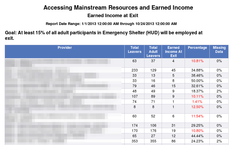
In this case, I ran the report on Emergency Shelters, so the blurred out Provider column is showing a list of Emergency Shelters, along with their specific numbers. I am using alerters to make anything under the goal be red, and anything above 2% missing data to be red as well.
The report includes about 7 different measures, some of them only applicable to certain program types. For each of the 7 measures, I also created a Detail page. Honestly, it started as a staging area for me. I built the measurement page, and in trying to get the formulas to come out right, I would add a tab, pull in all the relevant columns, and just play with them to see how they worked best together. Then I’d leave that in once I had it working, because I figured we would need to see Client IDs and such so we could back up the numbers that were showing on the Performance Measurement tabs. I made them look nice and tried to make them total up nicely to demonstrate what we were looking at. So in all, it’s 14 tabs plus the final one that gives the prompts and such.
Of course the question came up: if we’re going to use this report as a way of scoring applications and funding is tied to it, the agencies are going to mutiny if they don’t have a way of pulling this kind of data on themselves, one at a time, with details. So I struggled with that one awhile, trying to think of how we could use these 14 tabs for them, but then they’d see all of everyone’s data, and that wouldn’t be good. I was also thinking about the fact that the committee wasn’t going to necessarily need the detail pages in its report, since they’re just comparing the numbers, talking about things from more of a forest level than a leaf level.
So one day I made a copy of what I’d done so far with the main report, then went into the queries to change things up a bit. I took out the ability to choose a program type code and replaced it with a provider prompt. I pretty much kept everything else the same. So now when I ran it, I was getting the full report, but for only one provider. This made the performance measurement tabs very short and it made me think I could maybe combine the 14 pages into 7 by moving the detail block onto the performance measurement report. So I did that and liked the results.
Next, I started thinking about what I would want to know if it were me trying to be sure my agency was hitting all the performance goals. Basically I’d want to know if there were any measurement goals I wasn’t hitting, and if I wasn’t, then how far off was I? Next, I’d want to look at all my numbers to see if they matched what I understood about my program. If they didn’t, I’d want to look at the client IDs, and any relevant data so I could find any data quality issues or ask questions about how the measure was calculated. I’d also want to know when I’d achieved a measure successfully. It should be easy to see and recognize.
So I created formulas that would return different performance measurement goals depending on the program type code of the provider chosen in the prompt. So if I run the report as an Emergency Shelter, it gives me 7 tabs, and at the top of each one, it tells me what the goal is for my program type, what my numbers are, and if I achieved the goal, it says “Achieved” in green. If I didn’t achieve the goal, it returns the percentage I’m off by. So if we’re looking at Employed at Exit, the goal for Emergency Shelters is 10%. Let’s say my percentage is only 6%. Instead of “Achieved”, it would say “-4%” in red. Now I know that I’m a little bit off so I can look at my detail and try to figure out if I have any missing data that could be corrected to get my percentage up. Or I may have to think about reviewing the case manager workflow to be sure clients are being connected with employment services, where they exist. Here’s what it looks like:
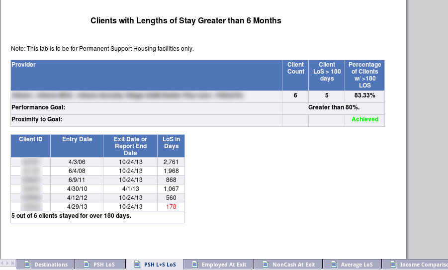
I think this design is good because you can see the goal compared to your numbers, and then you can see exactly which client is being counted that isn’t within the goal, so you can check for accuracy, or reflect on what happened with that client. It involved some pretty fun formulas that adjust based on which program type the provider you pick is. If I’d picked an Emergency Shelter and looked at this particular tab, it would have said “There is no goal for this measure.” and instead of “Achieved”, it would have said “N/A”.
This all sounds good, but in reality, what happened was I built the main 14 tab report and built the agency-level one off of it before the main report had been finalized. So there have been LOTS of changes to the main report that have not been reflected in the agency-level report. And it’s going to remain that way until we’re really really done with the main report and it’s been finalized and voted on in the Balance of State CoC meeting!
I plan to blog more about some of the details of this report, but this should give an overview of how I’m using ART to create it and organize the different needs of the users and board members.